Please click on the link(s) below to jump to a specific area of the article.
Quick Jump To Guide:
Main Options Menu
Layout or Flow Container Block
> Design
> Column
> Container Layout
Padding/Margin
Text Blocks
> Content
> Design
> Layout
Button Blocks
> Design
> Layout
Inventory Meta Text Blocks
> Design
> Layout
Inventory Meta Text Block - Tokens
Our Sitebuilder provides robust customization for your website needs. We are going to explore the powerful editing tools of ArtCloud's Sitebuilder here.
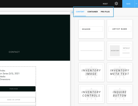
Main Options Menu
When you access any page editor or template page editor, you will first see your Main Options Menu: Content & Container. If you have a Website Pro Plus subscription, you will also see Pro Plus as a Main Option in this menu.
Content - This tab displays the blocks you can use to build your page.
Container - This tab displays the blocks that are used to hold your content.
You do not always need a Container block to hold Content. Flow Containers or Layout blocks are used when you want to display information next to each other. Read more here.
Pro Plus - This tab displays blocks that are included in Pro Plus subscriptions only. These range from additional blocks to build your page to specific blocks that would not be accessible on the page normally.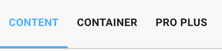
Layout or Flow Container Block
Accessible via the Container tab from the Main Options Menu, the Layout or Flow Container block allows users to place information or other blocks next to one another using Columns. You can choose between 1 - 4 columns to display on this block on the Design tab.-gif.gif)
Once you've Saved this Column adjustment in the Builder, you go on to adjust the Flow Containers settings.
When you hit Save at the bottom of the Sitebuilder, this will Save your progress as you work on your Page or Page Template. If you want changes to go live, you will need to hit the blue SAVE button in the top right corner.
Layout or Flow Container Tabs: Design, Column, Container Layout
- Design - You can adjust how many Columns you want to have and you can build a border for your Flow Container
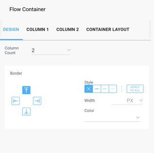
- Column - The settings for the column for how you want to display the block or content inside of that Column. You will see Column 1, Column 2, etc... tabs based on the amount you set in the Column Count on the Design tab, allowing you to customize the column for each block or content.
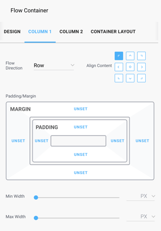
- Container Layout - You can make full adjustments to the entire Flow Container on this tab. If you want to add some space above or below your Flow Container, you can adjust the Margin on the top or bottom here.
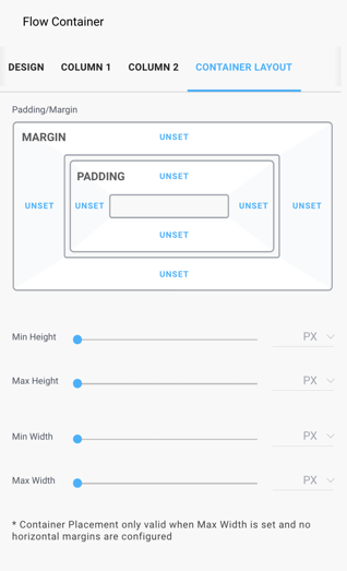
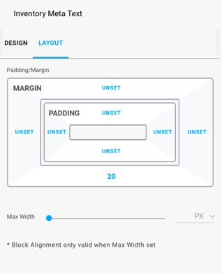
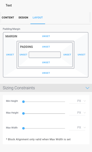
Padding / Margin
Throughout the Sitebuilder on various Blocks, you have the capability of setting the padding or margin of each specific block. This is usually found on the Layout tab of the block.
When you go to adjust your padding or margin, most of the time, you will see a default of Unset as the value. This just indicates that there is no padding or margin set for that specific side of the block.
Padding is the space around the object (and set within the border). Margin is the space around the border. A perfect use case would be a Button. We want our Inquire button to match our Make an Offer button, so let's adjust the padding and margin. We adjust padding (to 13px on both top and bottom) to separate the border from the text Inquire, and we adjusted the margin (to 15px on both top and bottom) to separate the border from the other button or any future buttons/information that may be added below the Inquire button:-gif.gif)
Text Blocks
When you drag + drop in a type of Text Block (Header, Artist Name, etc...) or a Text Block itself from your Content tab on the Main Options Menu, you're going to see the following layout: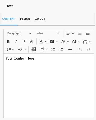
Text Block Tabs: Content, Design, & Layout
- Content - Here is where you'll add the Content for your Text Block. You can choose the style of the text, whether it should be centered or left-justified. You can set your font color, format, font background color, size, kerning, letter spacing and more. You can even add an HTML block here for Custom Content.
-gif.gif?width=318&name=2022-02-18_09-29-36%20(1)-gif.gif)
Design - This tab allows you to set a Background color for your Text Block. It also allows you to add a Border around your block.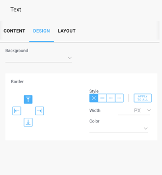
Layout - This tab allows you to add padding or a margin to your Text Block. In addition, you can set specific sizing constraints as well.
Button Blocks
There are three types of buttons in the Sitebuilder: Inquire, Purchase, & Make an Offer.
Both Purchase & Make an Offer buttons will display based on Conditions. If you have Stripe enabled, you'll be able to place a Purchase button on your Page or Template. If you have the Make an Offer toggle turned on on the Settings tab of your Sitebuilder, you'll have that button appear.
You will see the following layout of the Button block when you drag and drop it onto the Page or Template you're editing: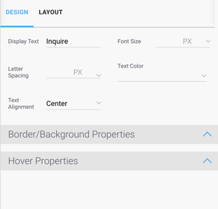
Button Tabs: Design & Layout
- Design - On this tab, you can change the Display Text of your button. For instance, if you don't want your Purchase button to display as 'Purchase', you can adjust this to display as Collect, Buy, or any other verbiage that might better suit. You can also adjust Font Size of the text, adjust the Letter Spacing of your Button text, Text Color, or adjust your Text Alignment.
In addition, if you want to change the color or border information of the button, you can do so in the Border/Background Properties options. And since most Buttons are respondent to hovering on them with your mouse, you can also adjust the Hover Properties of your button as well.
Check out as we add an Inquire button and adjust the settings for this Button:-gif.gif)
Layout - This tab will allow you to add padding or margin around your Button. In addition, you can also set the width of your Button here as well.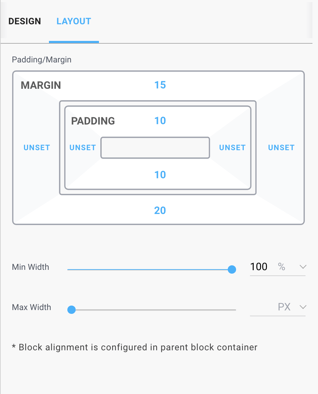
Inventory Meta Text Blocks
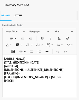
The Inventory Meta Text block shows the detail information for your Inventory piece, including Artist name, Title, Dimensions, Price & more. In the Sitebuilder, we use Tokens in order to display this information.
Inventory Meta Text Tabs - Design & Layout
- Design - Here is where you'll add Tokens or Content for your Inventory Meta Text Block. You can choose the style of the text, whether it should be centered or left-justified. You can set your font color, format, font background color, size, kerning, letter spacing and more. You can even add an HTML block here for Custom Content.
You can set and format the Tokens you want to display in this section. Tokens are labels set to represent something else or another object. We use tokens to display Artist Names, Titles, Edition data, etc... in this block.
You will see Tokens in your Inventory Meta Text when you start to build out your Page Templates. Since Page Templates are built to display the same for multiple Artist Pages or Inventory Pages or Exhibitions Pages, tokens allow you to display information that will be customized per Artist, Inventory, or Exhibition on your website.
For example: The {ARTIST_NAME} token that placed in this Design section tells the platform to display that specific artist's name when you go to the page this block is placed on. If this block is being configured for your Inventory Detail Page Template, we would see specific Artist names on each Inventory detail page because we added the token {ARTIST_NAME}.
If you want all Artist names on your Inventory Detail pages to display as bold, you can highlight the {ARTIST_NAME} token and bold it in this Design section: {ARTIST_NAME}. Now all of your Artist names on all inventory detail pages will display the specific Artist's name in bold. - Layout - This tab will allow you to add padding or margin around your Button. In addition, you can also set the width of your Button here as well.