
At ArtCloud, our goal is to offer tools to easily create beautiful and clean websites for our galleries and artists to display their work. Arguably, the most important part of any gallery or artist website is the way images are displayed. ArtCloud offers a breadth of options to display art pieces.
The goal of any website also includes making sure that that website is responsive. Responsive websites are an advent of the mobile device and viewing options for the web on smaller screens - they are websites that resize text, images, and other content on a website based on what device that are accessed on. In order to make images responsive, we must ensure that their dimensions are correctly entered to prevent behavior like this:
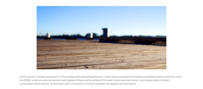
DESKTOP:
MOBILE:
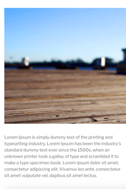 As you can see, the image has been cut in half, as if it's hanging off the right side of the website. How do we prevent this?
Screen sizes, percentages, and pixels
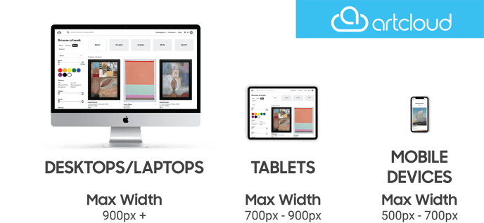
On the web, images and the screen sizes of various devices are measured in pixels (represented by writing a px next to our image size). Below is an idea of average image sizes based on device, measured by pixels:
Okay - so if I want to make an image the full width of a website, I should just set its width to the same dimensions as the size of my desktop's screen, right? Let's test this out.
NOTE: If you would like to quickly test how your site will appear on different screen sizes, you can adjust the size of your web browser to be as skinny as the screen that you would like to simulate.
// Menu setting the size of an image to pixels
This looks great on a desktop!
// Image of the image on a desktop
But not so great on a mobile device...
// Image of the image on a mobile device
So how do we fix this?
Making images responsive with percentages
WIDTH:
In order to set the width of an image on a website to look great on all types of screens, we should use percentages. Rather than setting the size of the images in pixels, we can set an image to take up a certain percentage of the screen's width. In the example below, I set the dimensions of the piece from a specific pixel amount to take up 80 percent of the page.
// Image of the editing screen in pixels next to its output on the mobile site
// Image of the editing screen in percent next to its output on the mobile site
This image will now take up 80% of any screen's width.
NOTE: Be sure to set the width of your image first.
HEIGHT:
The image's height will need to be a bit more precise, and should be set in pixels. To ensure that your image looks as tall or short as you would like,